
Incompass
With Open Hearts, We Open Doors
BRAND DEVELOPMENT * VISUAL IDENTITY * ART DIRECTION
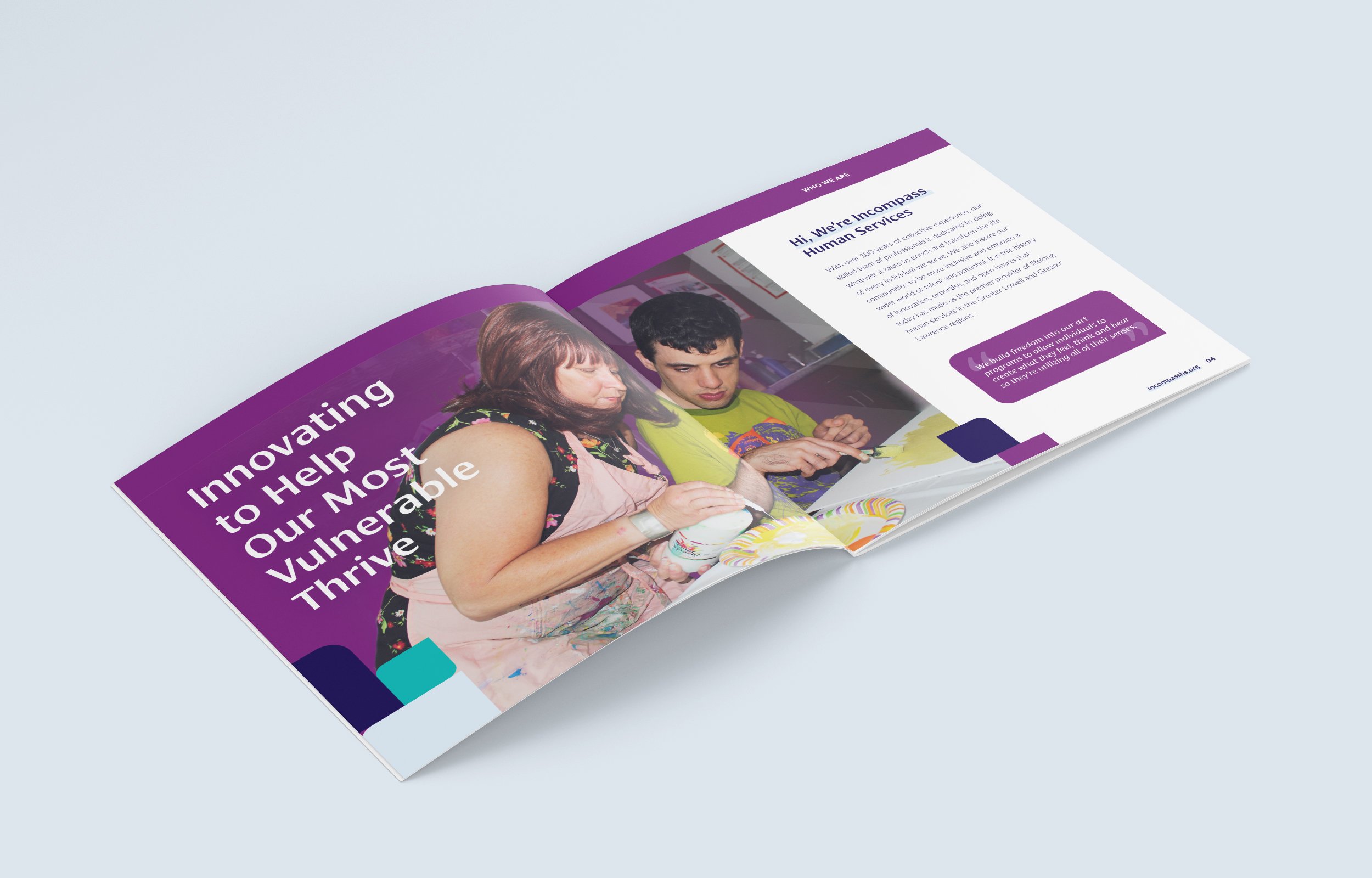
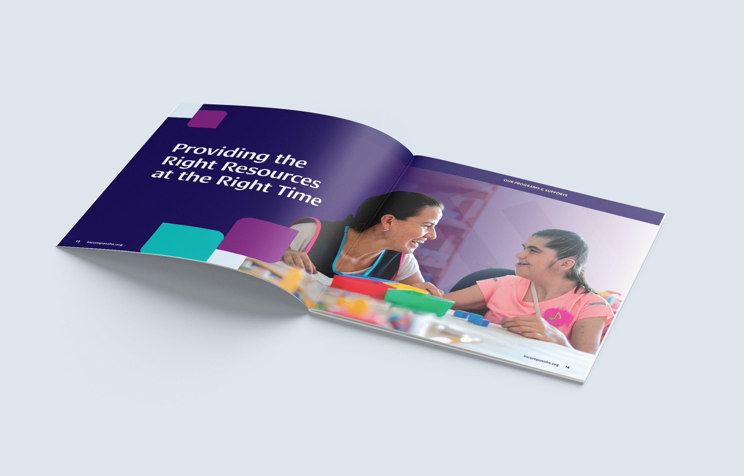
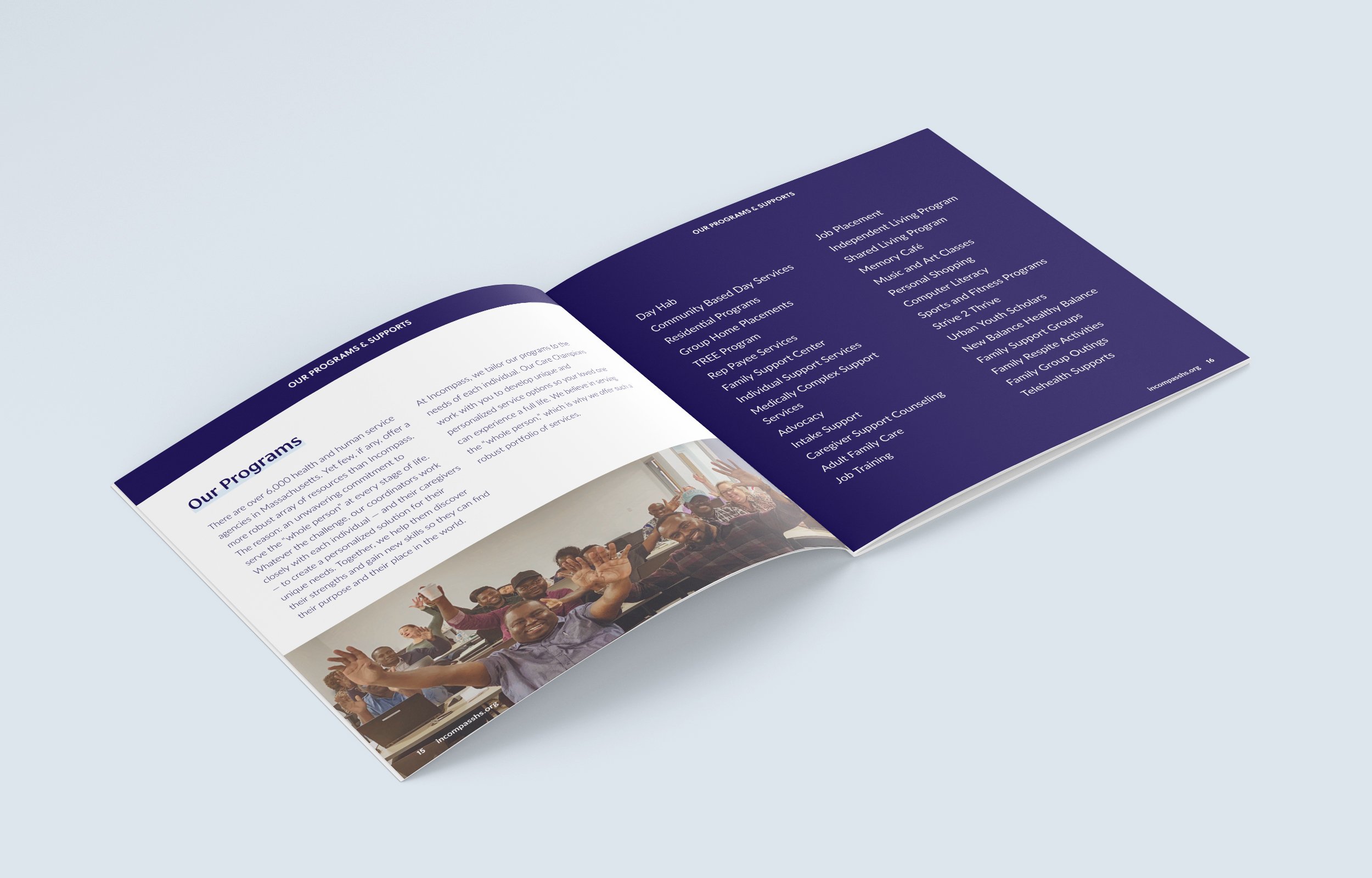
FKA LifeLinks CLASS, Incompass is a human services agency based in Merrimack Valley, MA, that offers supports and services for intellectually and developmentally disabled adults, their families and caregivers.
The logo needed to speak to the company's history of innovation, expertise, and "open hearts". We developed a heart shape comprised of the "i" "n" and "c" of Incompass. This simple, yet strong and modern design solidified their tagline and mission: With open hears, we open doors.


Innovating to help our most vulnerable thrive.The wordmark is set in Cora Medium and the service line is set in Lato Regular. I felt it appropriate to implement a humanistic font family and Cora strikes a nice balance between the trends of a quirky serif typeface and a techy sans serif. It has an energetic feel, while remaining warm and approachable.
For the rest of the type applications, Cora is paired with font family relative, Soleil. This cheery sans is highly readable and brings friendliness to body copy and supporting text, balancing Cora’s more refined feeling.


Collaborators:
WCM Partners