Digital Guardrails
The Path to Safe Connection
BRANDING DEVELOPMENT * VISUAL IDENTITY
Digital Guardrails is an educational program designed for families of rising middle school students across New Hampshire’s Seacoast region. Its mission is to prepare parents and children for the transition into smartphone and social media use; empowering them to build healthy digital habits before the first phone is in hand. The curriculum consists of virtual lessons distributed by teachers to students to work on at their own pace with their parent’s guidance, and in-person forums from early-education experts.

-
The program needed a brand identity that felt approachable to both parents and students, bridging the gap between education and empowerment. It had to avoid feeling overly institutional or fear-based, instead reflecting a tone of trust, growth, and guidance.
-
The core design challenge was to create a visual identity that spoke simultaneously to parents and pre-teens, balancing playfulness with credibility. The schools involved had no unifying branding system, and the identity also needed to remain neutral across districts (avoiding school-specific colors) while still feeling energetic and inclusive.
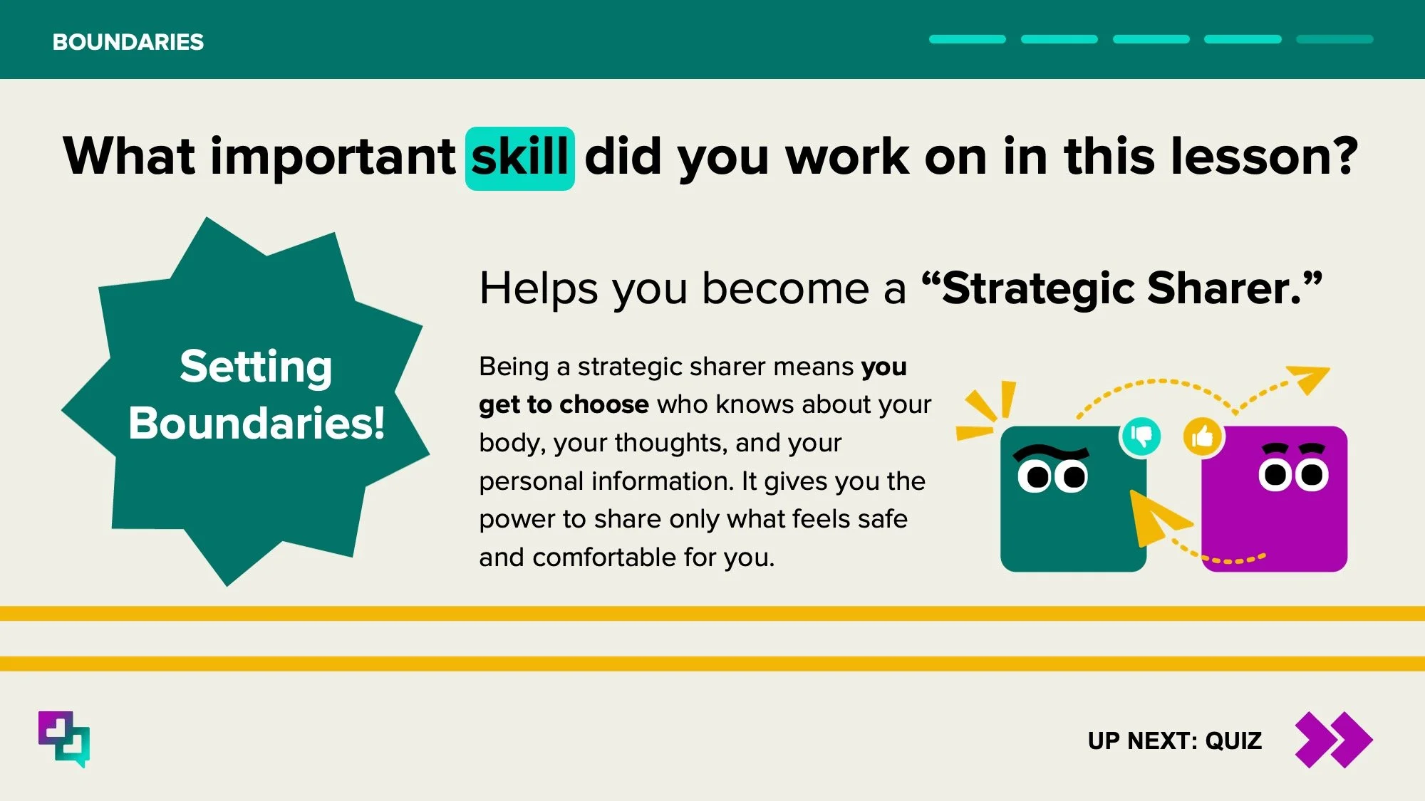
From a conceptual standpoint, the brand needed to move beyond “digital safety” as a restriction and reframe it as a pathway to confident, connected participation.
-
Through research and stakeholder conversations, several brand values emerged: Empowerment. Communication. Connection. Guidance. Warmth.
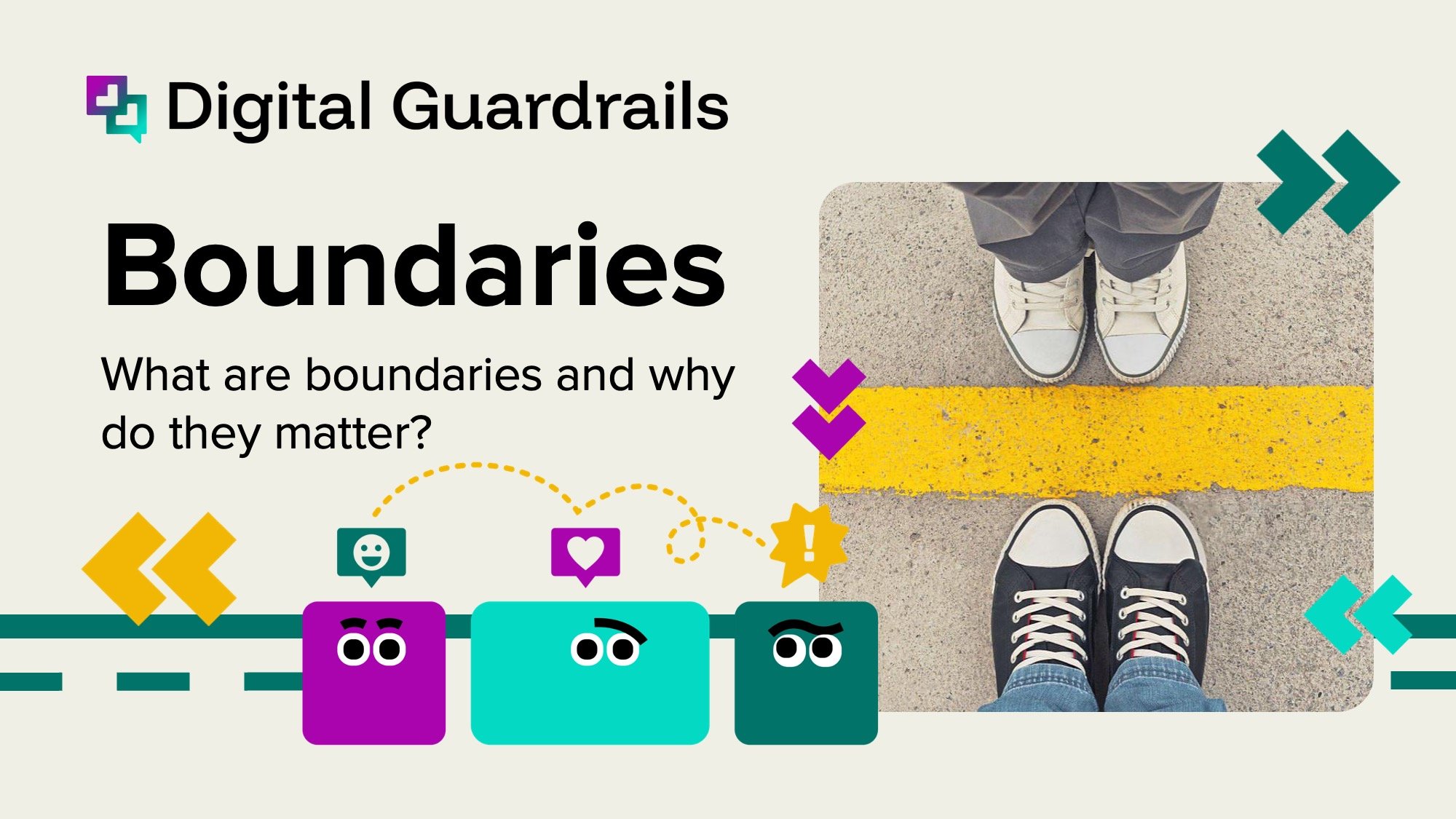
The concept of a learner’s permit for the digital world became a key metaphor shifting the narrative from control to preparation. This inspired the eventual brand direction: “The path to safe connection.”
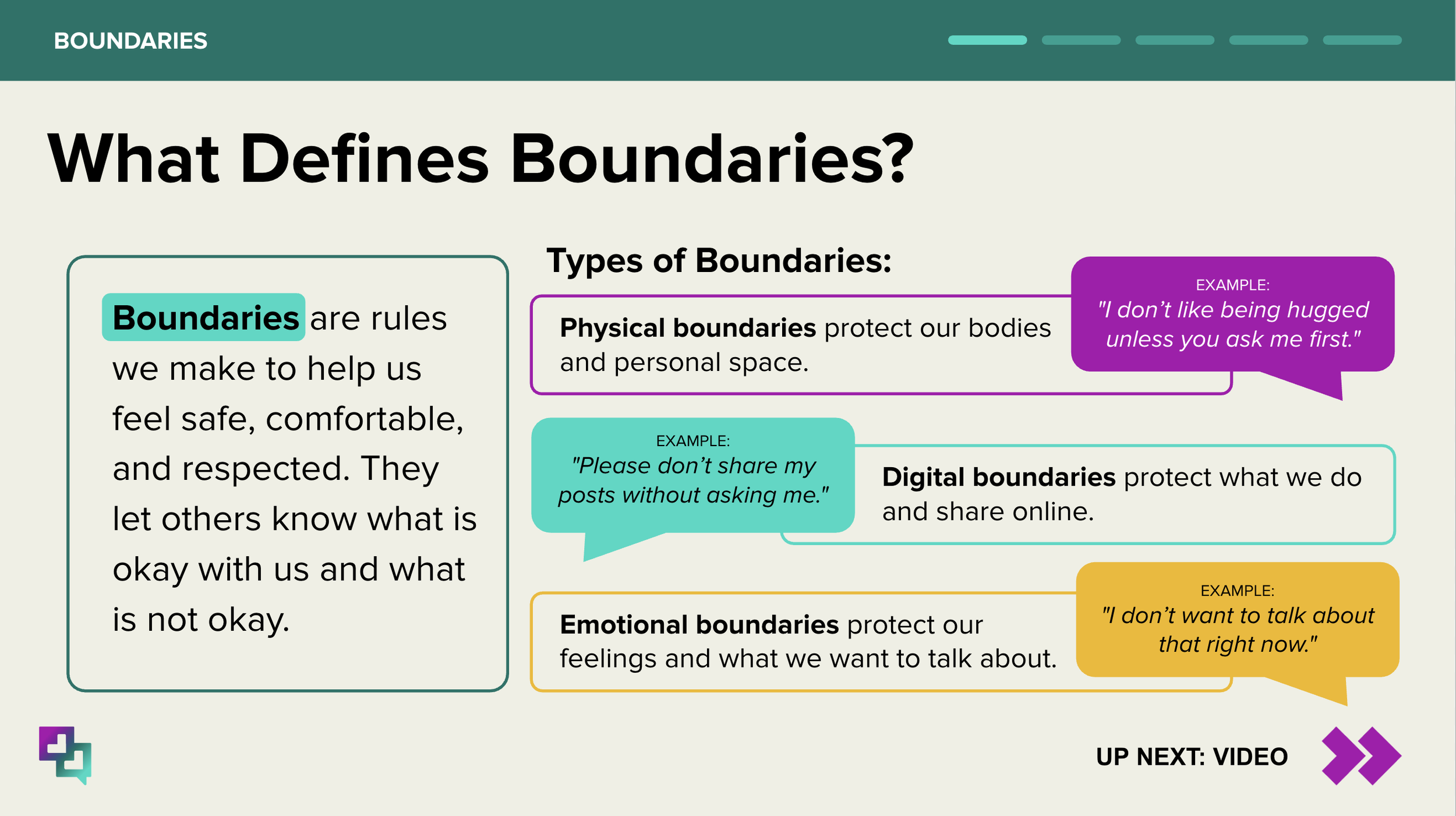
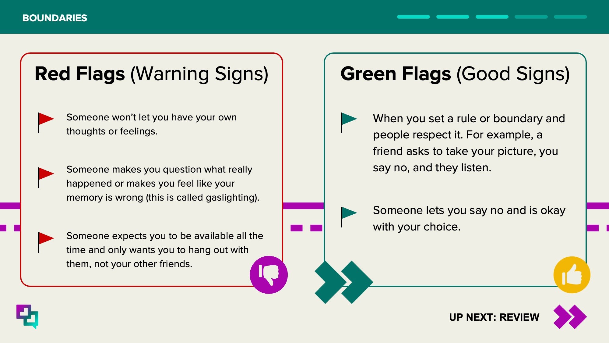
Rather than emphasizing boundaries, the focus moved toward developing skills, awareness, and conversation. The identity needed to visualize this sense of reciprocal learning and forward movement.


-
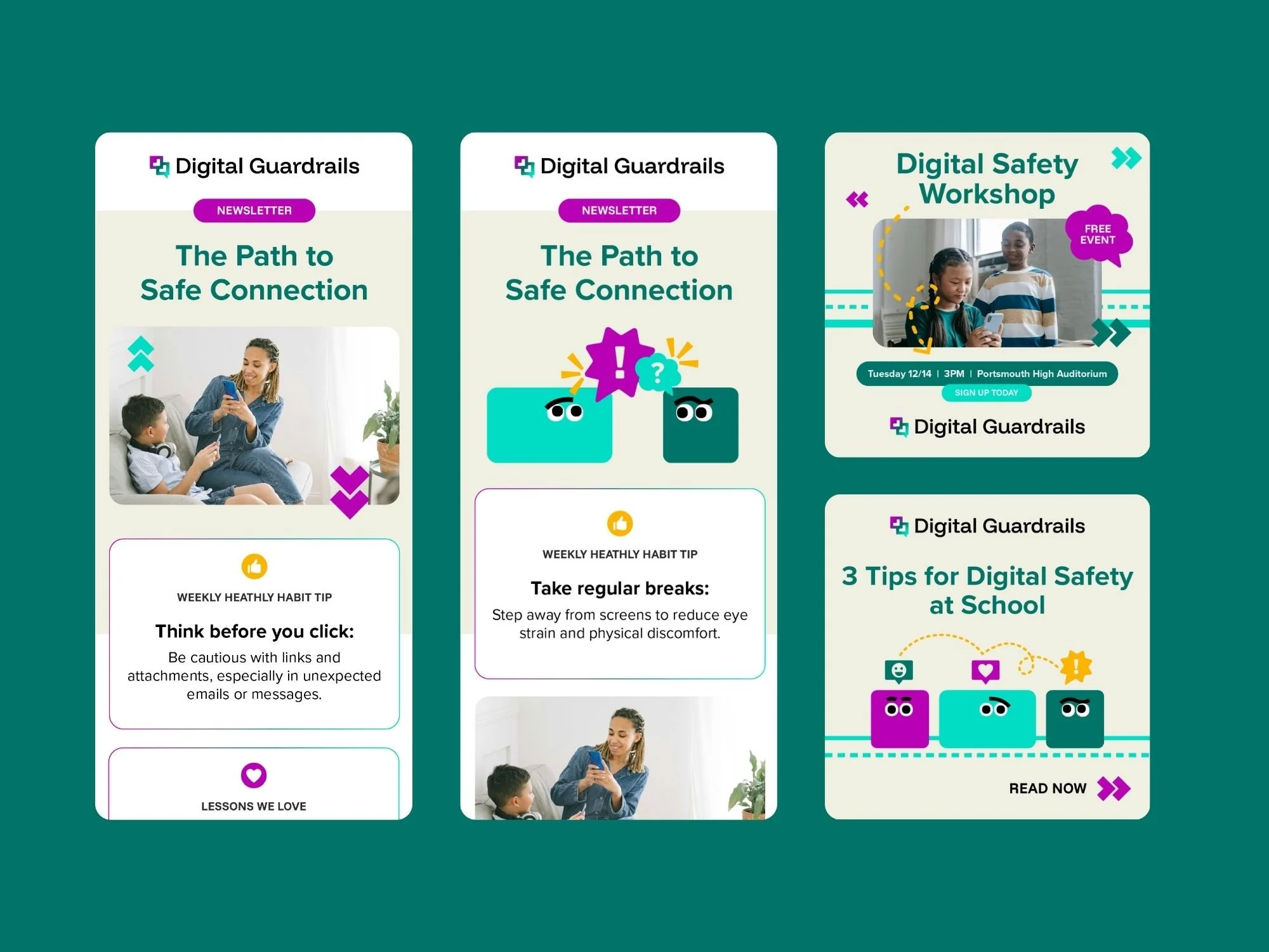
The final logo features two overlapping message bubbles, symbolizing dialogue and mutual learning between parent and child.
In their negative space, directional arrows subtly point toward one another representing guidance, empathy, and the idea of meeting halfway. These arrow-forms can also be read as hearts on their sides, suggesting care and emotional safety within digital communication.
This dual reading reflects the program’s philosophy: guidance without judgment, connection without fear.
The gradient transition from purple to teal reinforces the theme of growth and blending perspectives: the moment where youthful curiosity meets thoughtful guidance.
-
“The path to safe connection.”
This line encapsulates both the educational journey and the emotional goal of the program; turning digital access into an opportunity for connection, not division. -
The supporting visual system uses:
Modern sans-serif typography for accessibility and warmth
A gradient palette (purple → teal) symbolizing transition and harmony
Geometric shapes referencing pathways, roads/navigation, communication, and social media
Spot illustrations help bring complex emotions to life in an approachable way
Together, these elements create a tone that is friendly but credible and digital without being techy.
-
The resulting brand identity provides Digital Guardrails with a foundation that is:
Inviting to both parents and students
Distinct within educational and digital wellness contexts
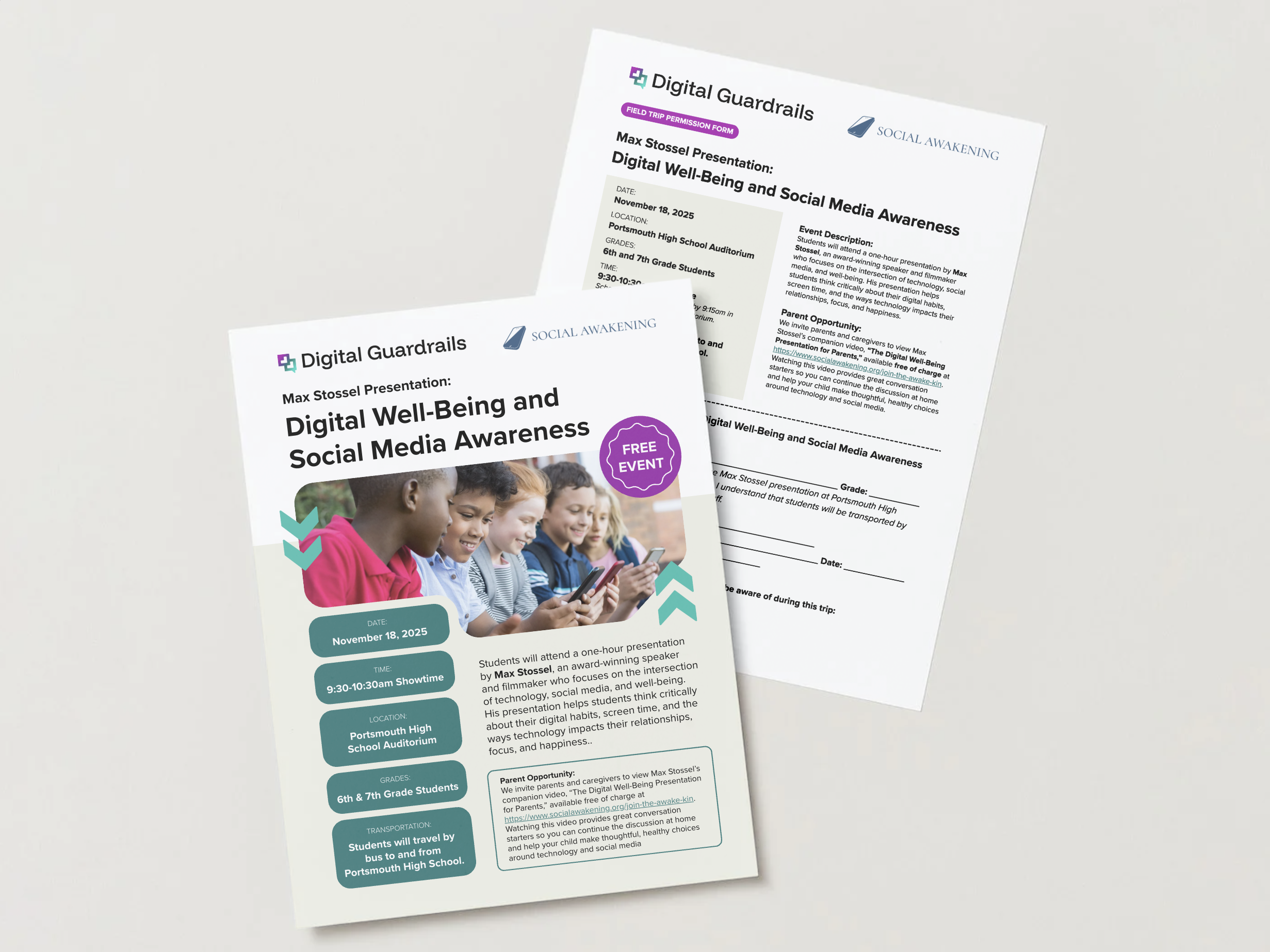
Flexible for use across flyers, social posts, and digital curriculum materials
Easy enough for teachers and staff to implement on their own; the brand guidelines go into extra detail on brand and visual identity usage and how to construct layouts
Most importantly, the identity helps reframe digital literacy as a shared journey built on conversation, care, and confidence.
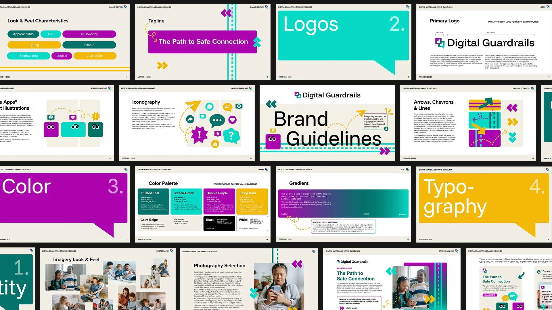
LogoLook & Feel Characteristics


Type & Color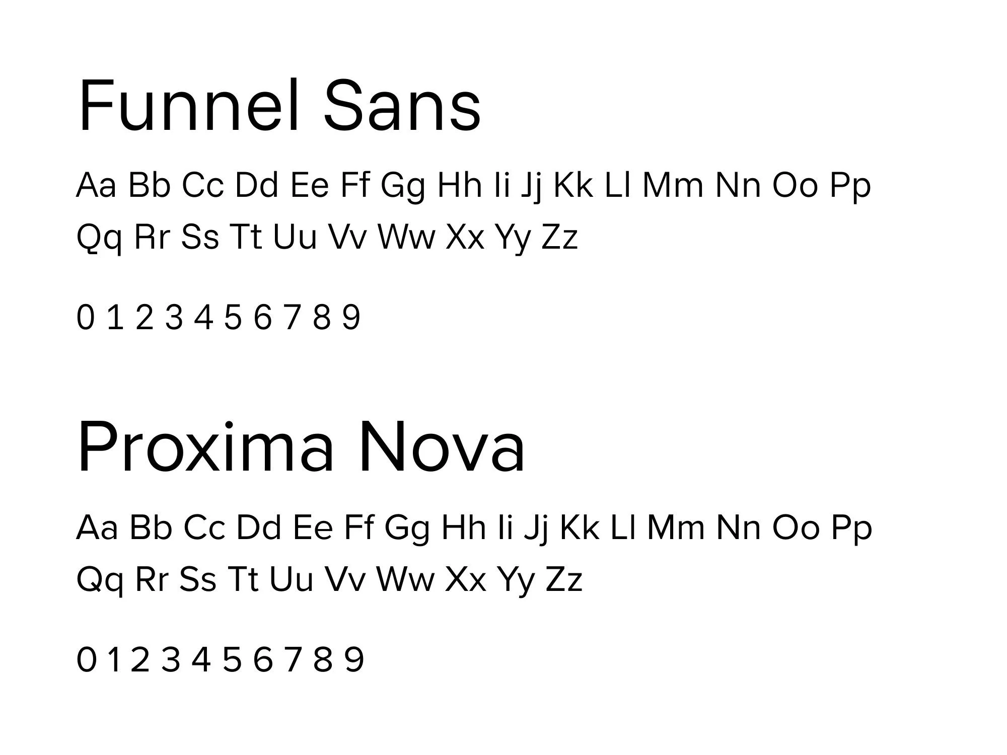

Graphic Elements & Icons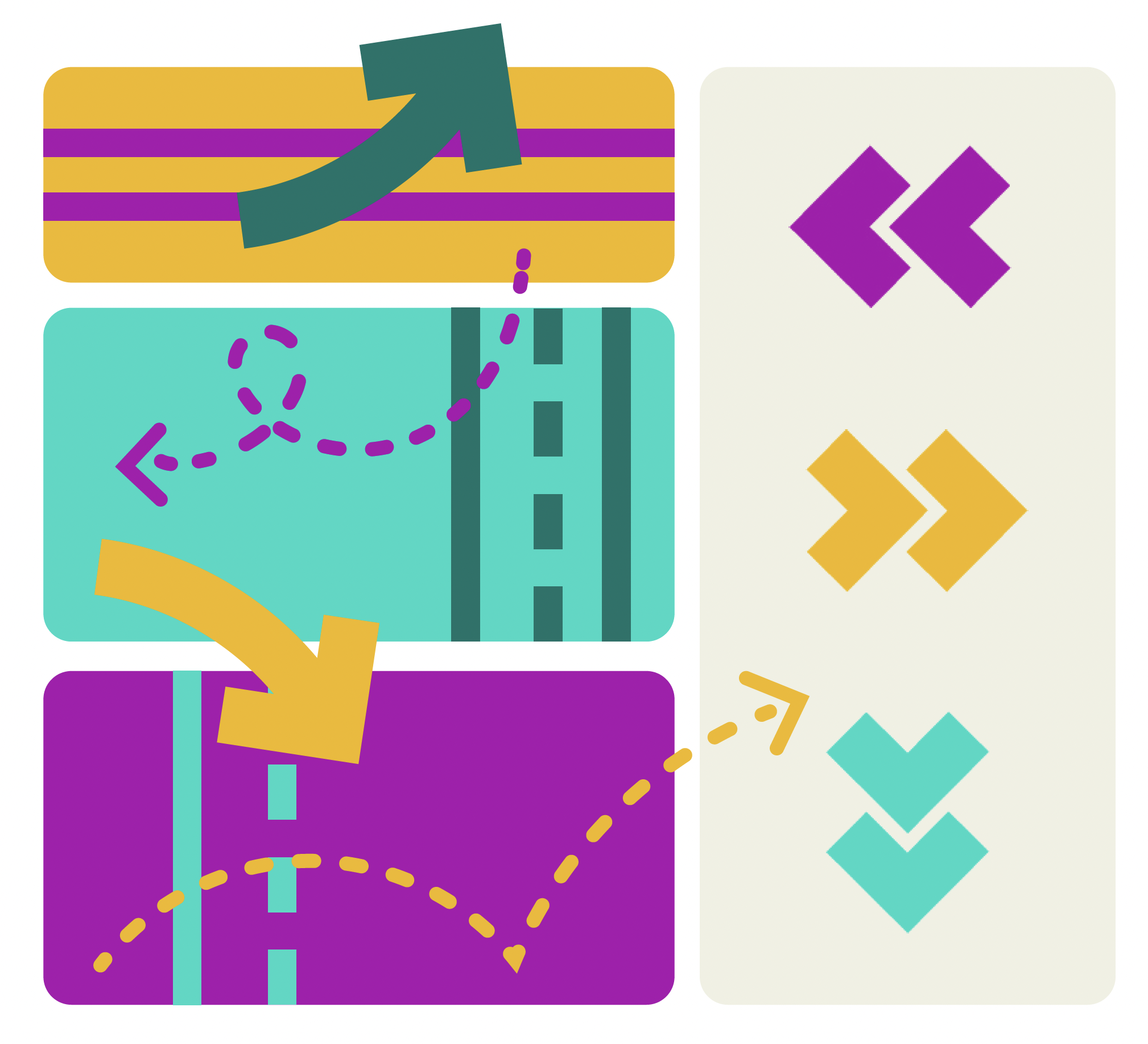
Spot Illustrations


Emails, Socials, & Flyers
Example Lesson